- AccordionNew
- Alert
- Alert DialogNew
- AutocompleteNew
- AvatarNew
- Badge
- Breadcrumb
- Button
- CalendarNew
- CardNew
- Checkbox
- Checkbox GroupNew
- CollapsibleNew
- ComboboxNew
- CommandNew
- Context MenuNew
- Date PickerNew
- DialogNew
- DrawerNew
- EmptyNew
- FieldNew
- FieldsetNew
- FormNew
- FrameNew
- GroupNew
- Input
- Input GroupNew
- KbdNew
- Label
- MenuNew
- MeterNew
- Number Field
- OTP FieldNew
- Pagination
- PopoverNew
- Preview CardNew
- Progress
- Radio Group
- Scroll AreaNew
- Select
- Separator
- SheetNew
- SkeletonNew
- Slider
- Spinner
- StepperNew
- Switch
- Table
- TabsNew
- Textarea
- ToastNew
- ToggleNew
- Toggle GroupNew
- ToolbarNew
- Tooltip
Hero
A split panel that opens a page — copy on one side, a full-bleed image on the other. It owns the page's only h1.
Industrial breakdown repair, on site the same day
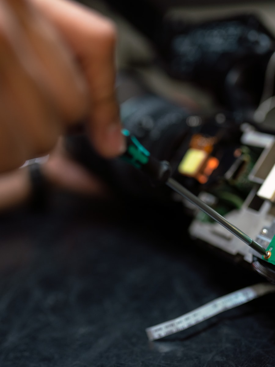
A hydraulic failure stops the whole line. Our technicians are on site the same day, with the parts already in the van.
import { HeroBlock } from "mako-ui/blocks/hero";
import { PhoneCall } from "mako-ui/icons/phone-call";
export default function Particle() {
return (
<HeroBlock
actions={[
{
icon: <PhoneCall aria-hidden="true" />,
label: "Call us now",
url: "#call",
},
{ label: "Request a quote", url: "#quote" },
]}
alt="A technician repairing a hydraulic hose on site"
eyebrow="Emergency repair"
imageHeight={1200}
imageUrl="/images/hydraulics-900x1200.jpg"
imageWidth={900}
description={
<p>
{
"A hydraulic failure stops the whole line. Our technicians are on site the same day, with the parts already in the van."
}
</p>
}
title="Industrial breakdown repair, on site the same day"
/>
);
}
When to use it
HeroBlock and Page Header are two compositions, not two crops of the same one. Page Header stacks a banner above the title and suits an editorial article. Hero juxtaposes the copy and the image, and suits a page that has to sell something: a service, a commitment, an offer.
Both render the page's only h1. Every other block hardcodes an h2, so exactly one of the two belongs on a page — and it belongs at the top, not in the body.
Props
HeroBlock
| Prop | Type | Default | Description |
|---|---|---|---|
title | string | — | The page's only h1. |
imageUrl | string | — | The side panel image. It renders with object-cover, so the source ratio does not matter — a portrait crop suits the tall panel best. |
imageWidth | number | — | Intrinsic pixel width. Optional, since the panel sizes the image itself; with imageHeight, it still tells the browser the ratio before the stylesheet lands. |
imageHeight | number | — | Intrinsic pixel height, same purpose. |
alt | string | — | Description of the image. Required unless isDecorative is set — the type forces the choice. |
isDecorative | boolean | — | Marks the image as decorative and renders an empty alt. |
eyebrow | string | — | Short label above the title, rendered as a pill. Says what kind of page this is. |
description | ReactNode | — | A node rather than a string, so the copy can carry <strong> or run to two paragraphs. |
actions | HeroAction[] | [] | At most two; extra actions are ignored. |
highlights | string[] | [] | Short points under the actions, one entry per item. The block renders the list and its check marks. |
footnote | string | — | Small print, and the place to answer an asterisk carried by the title. |
id | string | — | Id of the section, and the prefix every element id inside is derived from. |
HeroAction
| Prop | Type | Default | Description |
|---|---|---|---|
label | string | — | The button's label. |
url | string | — | The button's destination. |
emphasis | "primary" | "secondary" | — | Visual weight. The first action defaults to primary. |
icon | ReactNode | — | Optional icon inside the button. |
Examples
Highlights and a footnote
The optional line of checked points under the actions — checked items and a fine-print footnote, both at the measured 70% white.
Maintenance contracts built around your production
From the first audit to the maintenance plan, one partner covers the whole life of your equipment.
- 24/7 availability
- Certified technicians
- Original parts
Response within one working day, everywhere in Europe.

import { HeroBlock } from "mako-ui/blocks/hero";
export default function Particle() {
return (
<HeroBlock
actions={[
{ label: "Request a quote", url: "#quote" },
{ emphasis: "secondary", label: "See the catalogue", url: "#catalog" },
]}
footnote="Response within one working day, everywhere in Europe."
imageHeight={1200}
imageUrl="/images/technicians-900x1200.jpg"
imageWidth={900}
isDecorative
highlights={[
"24/7 availability",
"Certified technicians",
"Original parts",
]}
description={
<p>
{
"From the first audit to the maintenance plan, one partner covers the whole life of your equipment."
}
</p>
}
title="Maintenance contracts built around your production"
/>
);
}
Options this block does not have
No ratio. The panel crops its image, so the prop would change nothing a different source file cannot already express.
No tone. Only the navy ground is offered, and it is the one the gradient and the contrast ratios were measured against. Three grounds would be three contrast audits for one requirement.
Contrast
The secondary copy — highlights and footnote — renders at 70% white. On a gradient the worst case is the light end, not the dark one: 70% measures 8.40:1 against blue-950 and 5.43:1 against blue-900, both clear of the 4.5:1 that AA asks for body text. Full white stays above 9:1 across the whole ramp, so the gradient costs nothing in legibility.