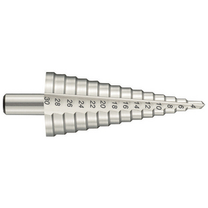
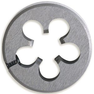
Components
- AccordionNew
- Alert
- Alert DialogNew
- AutocompleteNew
- AvatarNew
- Badge
- Breadcrumb
- Button
- CalendarNew
- CardNew
- Checkbox
- Checkbox GroupNew
- CollapsibleNew
- ComboboxNew
- CommandNew
- Context MenuNew
- Date PickerNew
- DialogNew
- DrawerNew
- EmptyNew
- FieldNew
- FieldsetNew
- FormNew
- FrameNew
- GroupNew
- Input
- Input GroupNew
- KbdNew
- Label
- MenuNew
- MeterNew
- Number Field
- OTP FieldNew
- Pagination
- PopoverNew
- Preview CardNew
- Progress
- Radio Group
- Scroll AreaNew
- Select
- Separator
- SheetNew
- SkeletonNew
- Slider
- Spinner
- StepperNew
- Switch
- Table
- TabsNew
- Textarea
- ToastNew
- ToggleNew
- Toggle GroupNew
- ToolbarNew
- Tooltip
Cards
A grid of flexible cards with no named types — what a card looks like follows from which props are present.
Our solutions
Our ranges and services, organised by theme.

InnovationA complete range of Roebuck abrasives
Professional solutions for sanding, deburring and finishing needs.

Industrial maintenance every day
A focused selection for day-to-day maintenance work, available from stock.
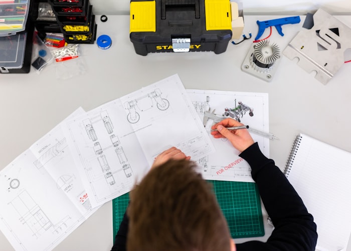
NewPersonal protective equipment
Equipment and consumables to protect your teams, compliant with current standards.
import { CardsBlock, type CardsBlockItem } from "mako-ui/blocks/cards";
const cards: CardsBlockItem[] = [
{
actions: [
{ label: "Discover", url: "#discover" },
{ label: "See the brochure", url: "#brochure" },
],
description:
"Professional solutions for sanding, deburring and finishing needs.",
imageUrl: "/images/machining-700x500.jpg",
tagLabel: "Innovation",
title: "A complete range of Roebuck abrasives",
},
{
actions: [{ label: "Discover", url: "#discover" }],
description:
"A focused selection for day-to-day maintenance work, available from stock.",
imageUrl: "/images/maintenance-700x500.jpg",
title: "Industrial maintenance every day",
},
{
actions: [
{ label: "Discover", url: "#discover" },
{ label: "See the brochure", url: "#brochure" },
],
description:
"Equipment and consumables to protect your teams, compliant with current standards.",
imageUrl: "/images/metrology-700x500.jpg",
tagLabel: "New",
title: "Personal protective equipment",
},
];
export default function Particle() {
return (
<CardsBlock
cards={cards}
subtitle="Our ranges and services, organised by theme."
title="Our solutions"
/>
);
}
Props
CardsBlock
| Prop | Type | Default | Description |
|---|---|---|---|
cards | CardsBlockItem[] | — | The cards. The column ceiling is derived from the count; the block renders nothing when empty. |
tone | "light" | "dark" | "light" | Default tone for every card. Each card may override it. |
imageFit | "cover" | "framed" | "cover" | Uniform across the grid: cover crops to a landscape ratio, framed shows the whole image inside the card's padding, with a border. |
textAlign | "start" | "center" | "start" | Uniform across the grid. start follows the writing direction. |
title | string | — | Optional section heading, rendered as an h2. |
subtitle | string | — | Optional line under the heading. |
id | string | — | Id of the section, and the prefix every element id inside is derived from. |
CardsBlockItem
| Prop | Type | Default | Description |
|---|---|---|---|
title | string | — | The card's title. |
description | string | — | Short text under the title. |
imageUrl | string | — | The card's image. |
imageWidth | number | — | Intrinsic pixel width. With imageHeight, lets the browser reserve the box — a framed image shifts the layout without them. |
imageHeight | number | — | Intrinsic pixel height, same purpose. |
tagLabel | string | — | Yellow pill, overlaid on a cover image or inline above the title otherwise. |
tone | "light" | "dark" | — | Overrides the grid tone for this card only, so one card can stand out. |
actions | CardAction[] | — | At most two. The grid reserves slots so actions align across a row. |
CardAction
| Prop | Type | Default | Description |
|---|---|---|---|
label | string | — | The button's label. |
url | string | — | The button's destination. |
emphasis | "primary" | "secondary" | — | Visual weight. The first action defaults to primary. |
icon | ReactNode | — | Optional icon inside the button. |
Examples
Dark tone with framed images
framed shows the whole image uncropped — a catalogue cover that carries information. One card overrides the grid tone to stand out.

import { CardsBlock, type CardsBlockItem } from "mako-ui/blocks/cards";
const cards: CardsBlockItem[] = [
{
actions: [{ label: "Download", url: "#download" }],
imageUrl: "/images/catalogue-1-296x417.jpg",
title: "The essentials June-August 2026",
},
{
actions: [{ label: "Download", url: "#download" }],
imageUrl: "/images/catalogue-2-296x417.jpg",
title: "CAP Industry spring-summer",
},
{
actions: [{ label: "Download", url: "#download" }],
imageUrl: "/images/catalogue-3-296x417.jpg",
tone: "light",
title: "Spring-summer 2026 collection",
},
];
export default function Particle() {
return (
<CardsBlock
cards={cards}
imageFit="framed"
subtitle="Limited-time promotional catalogues."
tone="dark"
title="Current offers"
/>
);
}
Centered category tiles
textAlign="center" with a single secondary action per card.
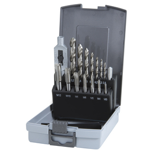
Our products for tapping and drilling
import { CardsBlock, type CardsBlockItem } from "mako-ui/blocks/cards";
const cards: CardsBlockItem[] = [
{
actions: [
{ emphasis: "secondary", label: "See the products", url: "#taps" },
],
imageUrl: "/images/product-taps-300x300.jpg",
title: "Taps and accessories",
},
{
actions: [
{ emphasis: "secondary", label: "See the products", url: "#drilling" },
],
imageUrl: "/images/product-drilling-300x300.jpg",
title: "Drilling",
},
{
actions: [
{ emphasis: "secondary", label: "See the products", url: "#dies" },
],
imageUrl: "/images/product-dies-300x300.jpg",
title: "Dies and accessories",
},
];
export default function Particle() {
return (
<CardsBlock
cards={cards}
imageFit="framed"
textAlign="center"
title="Our products for tapping and drilling"
/>
);
}